Lately, I’ve been working on Deskblock, a design system and component library for building Zoho Desk extensions. One of the key challenges has been developing a color system, as the interface includes five themes, supports both light and dark modes, and accommodates three contrast levels for accessibility. My goal is to build a roubst color system that simplifies these complexities and provides an easy-to-use token system, enabling designers and developers to focus on features rather than the intricacies of color management.
Through this process, I’ve done extensive research and built tools to automate the process. In this article, I’ll share some of the insights and the tools that I’ve built, hoping to equip you with everything you need to create a robust color system for your own projects.
Color Space
Selecting the right color space is very essential. A perceptually uniform color space is typically preferred over usual RGB spaces like sRGB, as it greatly simplifies the process of building a color system.

Initially, I experimented with two color spaces OKLCH and HCT, before deciding on HCT. OKLCH has sharper transitions at both ends of the spectrum, but HCT offers a more gradual transition in lightness. Since the application I’m designing this color system for has three surface background colors, I need more resolution near both end of the spectrum, HCT felt like the ideal choice for my needs.
Ideally, you should choose a color space with a simple geometric shape to ensure colors stay within the gamut and maintain orthogonal lightness and hue. HCT lacks a simple geometric shape, but spaces like OKHSL and OKHSV offer this advantage. Check out this article to learn more.
Note:
Also, the Material Color Utilities library, which I used for HCT, is limited to the sRGB space with 8-bit precision. If you need support for wider gamuts, checkout ColorAide’s implementation of HCT.
Tools
I’ve developed tools to automate the process of building color systems: one for the web and another as a Figma plugin. These tools take your existing brand color and generate a tailored palette directly from it.
HCT Palette Plugin for Figma
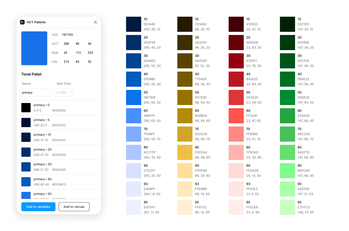
To use the Figma plugin, begin by entering a base color in HEX, RGB, or HSL format. The plugin will automatically generate the corresponding HCT color palette. You can name your palette descriptively—e.g., “Primary,” “Success,” or “Danger”—to keep it organized. By default, tones are generated in increments of 10 from 0 to 100, but you can easily customize the palette by adding or removing specific tones as needed!
Once your palette is ready, you can use the “Add to Canvas” button to place it directly on your Figma canvas or the “Add to Variables” button to directly save it as a Figma’s variables.
HCT Tonal Palette Generator
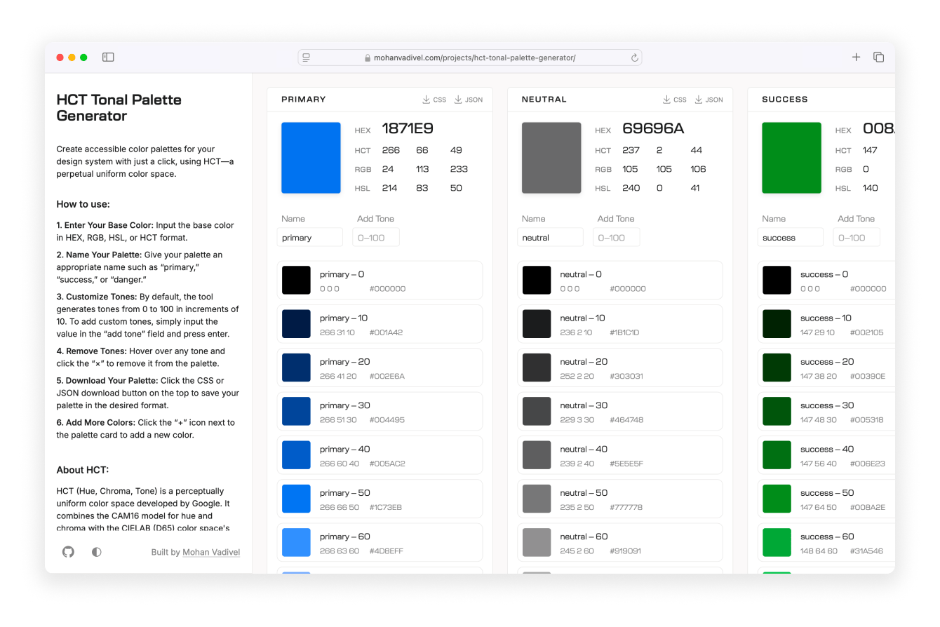
The web tool works very similar to the Figma plugin, but instead of adding palettes to the Figma canvas, it allows you to download your palette as CSS or JSON.
Refining Palette
Note:
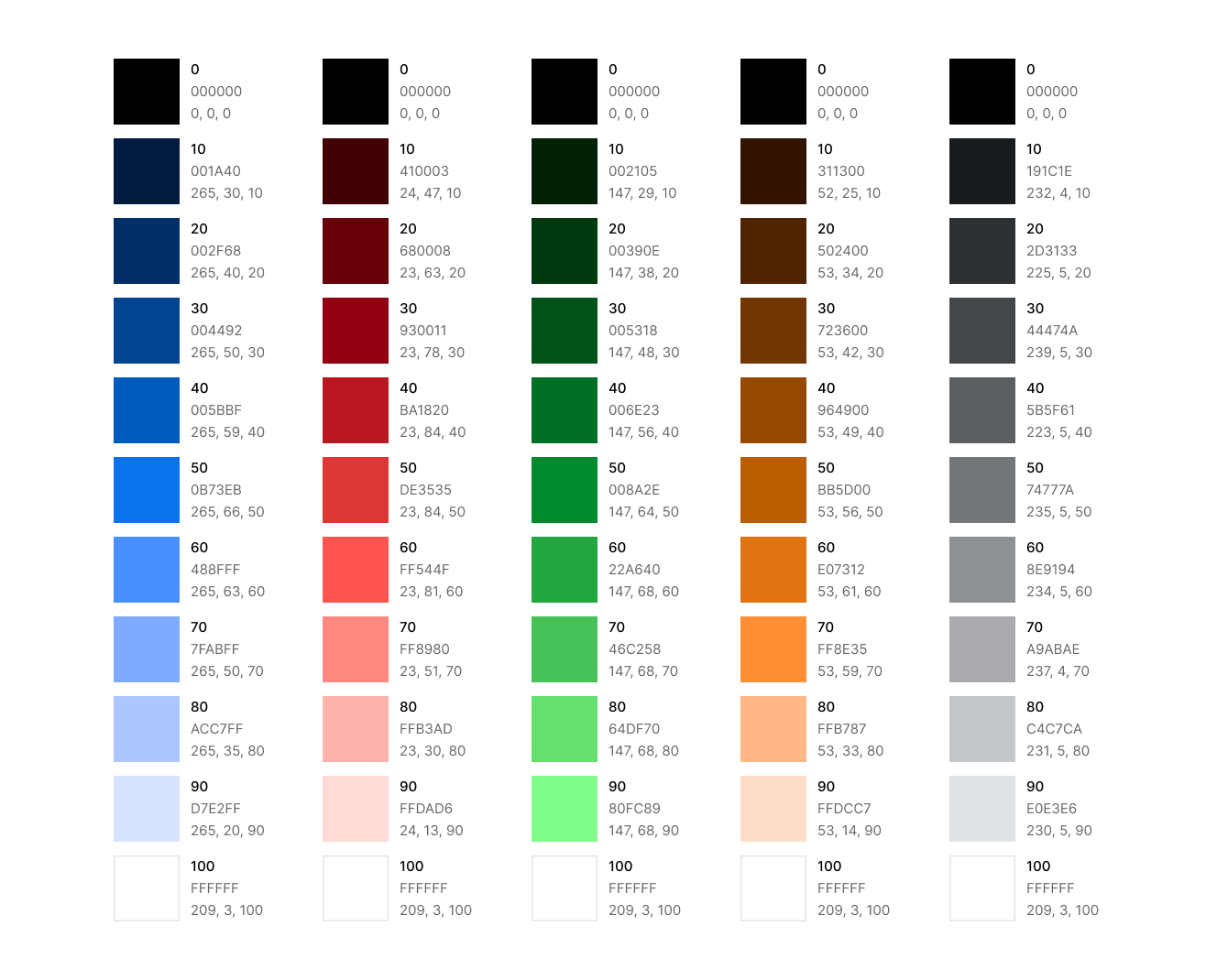
The HCT tool makes it easy to build palettes. However, you might occasionally notice that certain colors, like green, appear slightly off or deviate from the intended hue. For example, take the green palette, green-50 is the brand color and serves as the base for the palette. Upon reviewing the palette, you might want green-60, green-70, green-80, and green-90 to lean toward a cooler, teal hue.
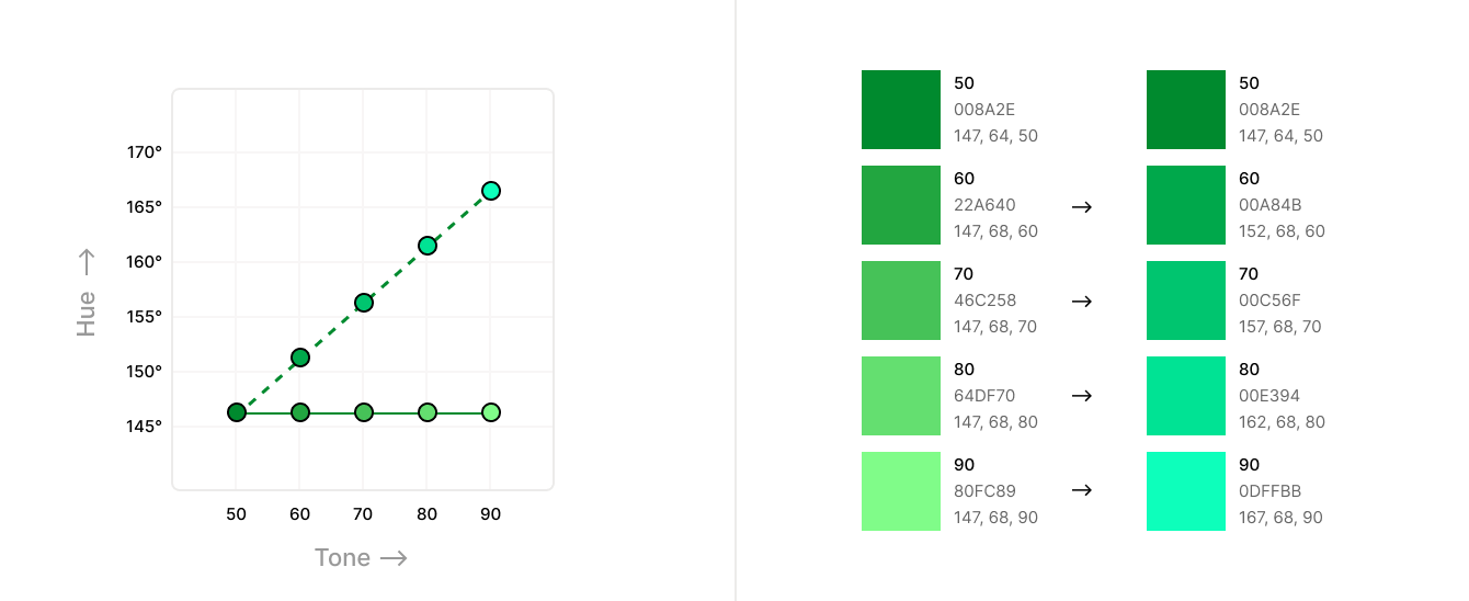
To adjust this, select green-90 in the tool and increase the hue value while keeping the chroma and tone constant. Let’s say you settle on a hue of 167° for green-90. Take the hue of green-50 (147°) as the starting value and green-90 (167°) as the final value, then interpolate to calculate the intermediate hues. This approach provides a gradual, cohesive shift toward the desired hue.
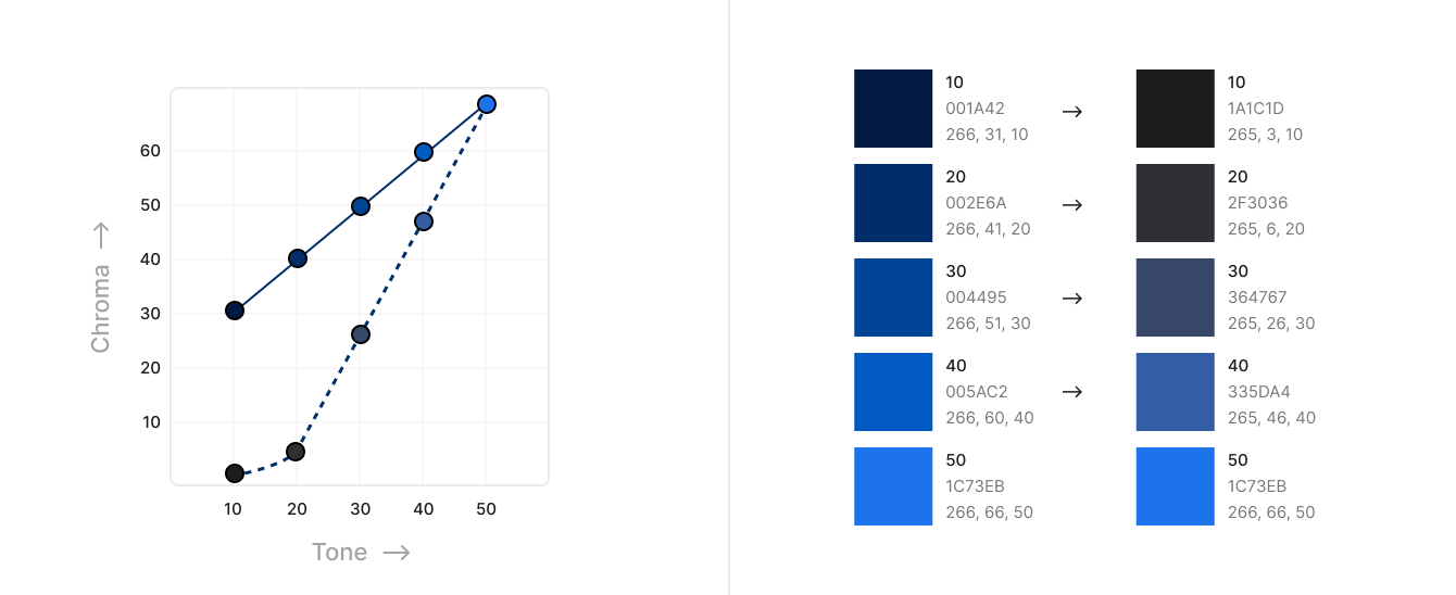
Similarly, if you’re planning to support both light and dark modes, you may prefer lower chroma for darker tones such as blue 40, 30, and 20. Using the same approach as before, select the desired chroma for blue-20 while keeping the hue and tone constant. For instance, if you choose blue-20 (chroma of 6) as the starting value and blue-50 (chroma of 63) as the endpoint, you can apply linear interpolation to calculate the intermediate chroma values. Apply this method across all hues to get the final, refined palette.
Note:
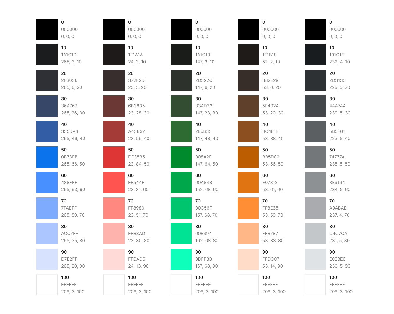
Accessibility
Before diving into color tokens, let’s touch on accessibility. HCT simplifies contrast calculations using its tone, which corresponds to CIELAB perceived lightness. This means that the contrast between two colors with equal tonal differences, such as 10–40 and 50–80 (both 30 tones apart), will result in nearly the same value.
So when selecting colors for a background and foreground, just ensure they are enough tones apart for adequate contrast. With contrast calculation inherently built into HCT, it becomes easier to create accessible color pairings.

Semantic Color Tokens
The semantic token system organizes colors in a structured and meaningful way, making them easier to manage and apply. The best part is that when working with multiple themes, there’s no need to work for each theme seperately. Because perceived lightness is consistent across hues, you can design tokens for a single hue and seamlessly translate them to others, saving you a significant amount of time.
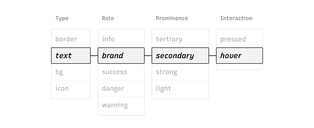
Rather than explaining every parameter in detail here, I invite you to checkout the color page from the design system I’ve built, where I delve into all the nuances.