For a website to be readable, it’s essential that text, UI elements, and informational graphics maintain adequate contrast. With the growing emphasis on accessibility worldwide, numerous governments have introduced regulations/guidelines mandating that websites adhere to the Web Content Accessibility Guidelines (WCAG) standards.
Problems with WCAG 2 simple contrast
The WCAG 2 was officially published on December 11, 2008. The simple contrast algorithm in WCAG 2 were adopted without any empirical research, and I assume this algorithm was developed with older displays (CRTs), web safe fonts & colors in mind. The WCAG 2 simple contrast algorithm has several acknowledged limitations, the algorithm does not account for the complex ways in which humans perceive contrast. It treats all colors uniformly, without considering how different hues and saturations affect visibility. This can lead to situations where text meets the required contrast ratio but is still hard to read, or on the flip side, text that doesn’t meet the contrast ratio criteria and is surprisingly legible.
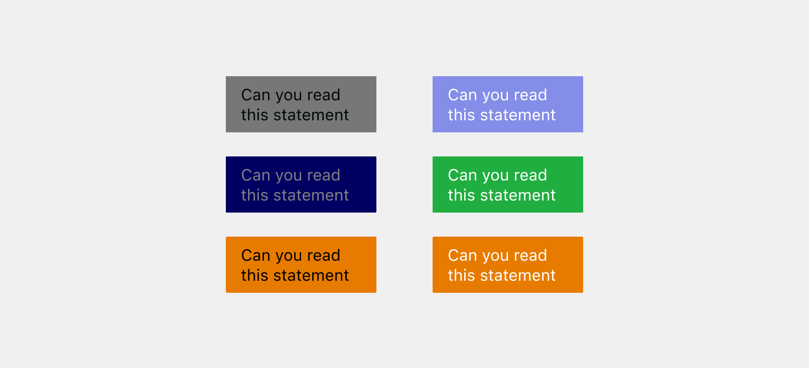
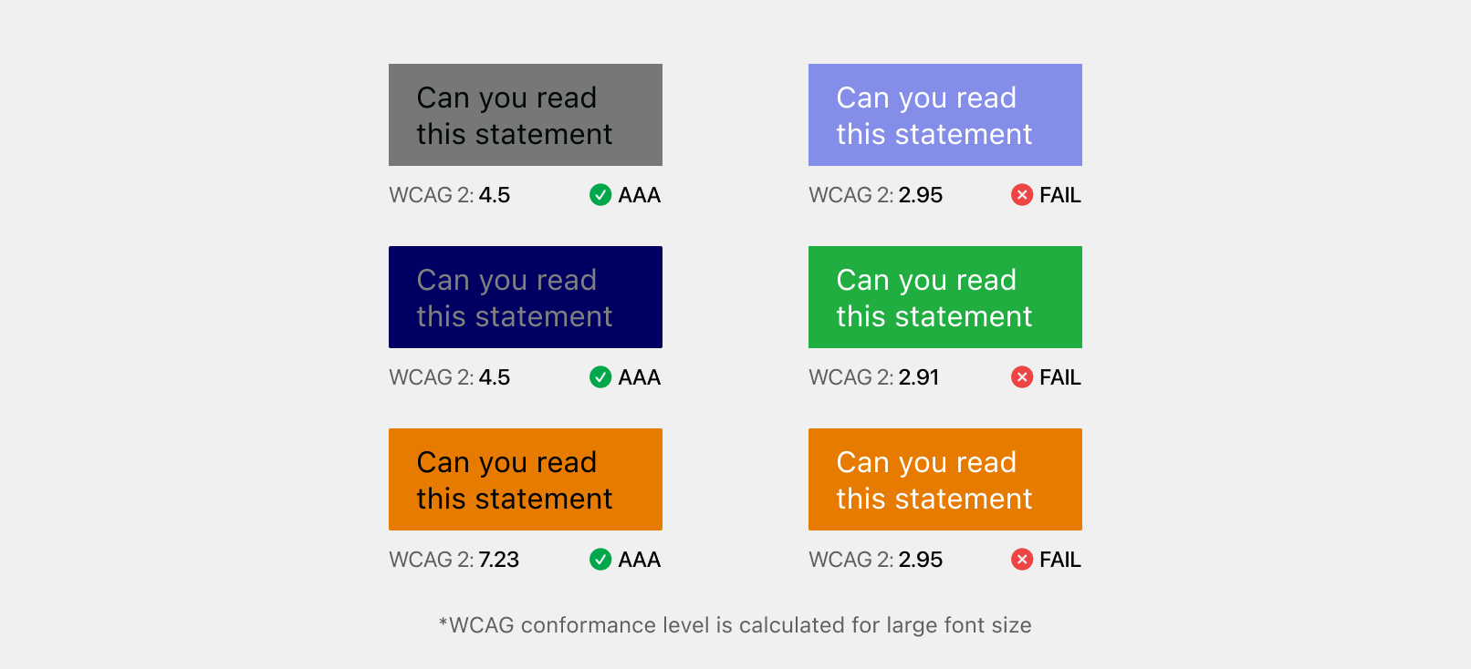
Take a look at the image above, which column do you find more legible? Personally, I find the text in the second column to be significantly clearer and to have higher contrast compared to the first column. However, when these colors are fed into the WCAG 2 simple contrast algorithm, the color combinations in the first column meet the AAA conformance level for large text, whereas none of the color combination in the second column meet the required criteria.
W3C is already aware of this issue, as Andrew Somers started a discussion back in Apr, 2019. Fast forward 2 years, Accessible Perpetual Contrast Algorithm (APCA) was developed as a replacement for WCAG 2 simple contrast, and is now a part of the WCAG 3 Working Draft.
Accessible Perceptual Contrast Algorithm (APCA)
Note:
APCA takes font size and weight into account for contrast calculation and is perpetually accurate. This means that a doubling of the APCA value corresponds to a doubling of perceived contrast, and vice versa. Thus, a specific contrast value, such as Lc 69, delivers a consistent level of perceived contrast across all color combinations, regardless of their lightness or darkness. The APCA measures contrast with an Lc value (lightness contrast) that ranges from Lc 0 to ±Lc 106. For the purposes of accessibility, an Lc value of 15 is considered the visibility threshold for many users, especially in the case of thin lines or borders. Meanwhile, an Lc value of 90 is recommended as the minimum for body text columns.
You might have noticed that the APCA values can be negative, unlike WCAG 2 where swapping the foreground and background colors yields the same contrast value, APCA is sensitive to polarity. The light text on a dark background results in a negative value, whereas dark text on a light background generates a positive value.
Now, let’s input the color combinations from the previous example into the APCA algorithm.
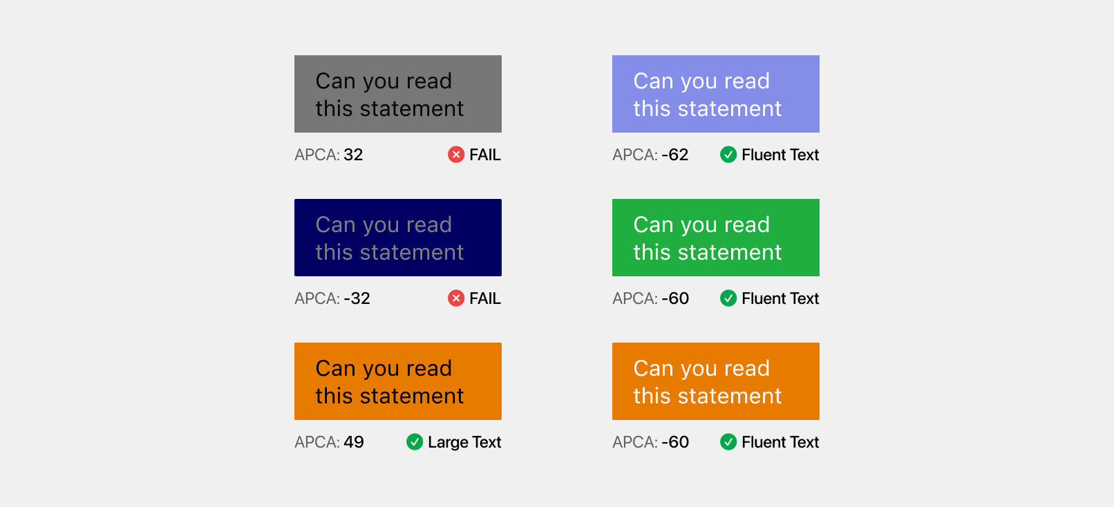
From the above image, it is clear that the APCA reports better contrast values than WCAG 2 simple contrast. Checkout the conformance for more information on interpreting APCA values.
Bridge PCA
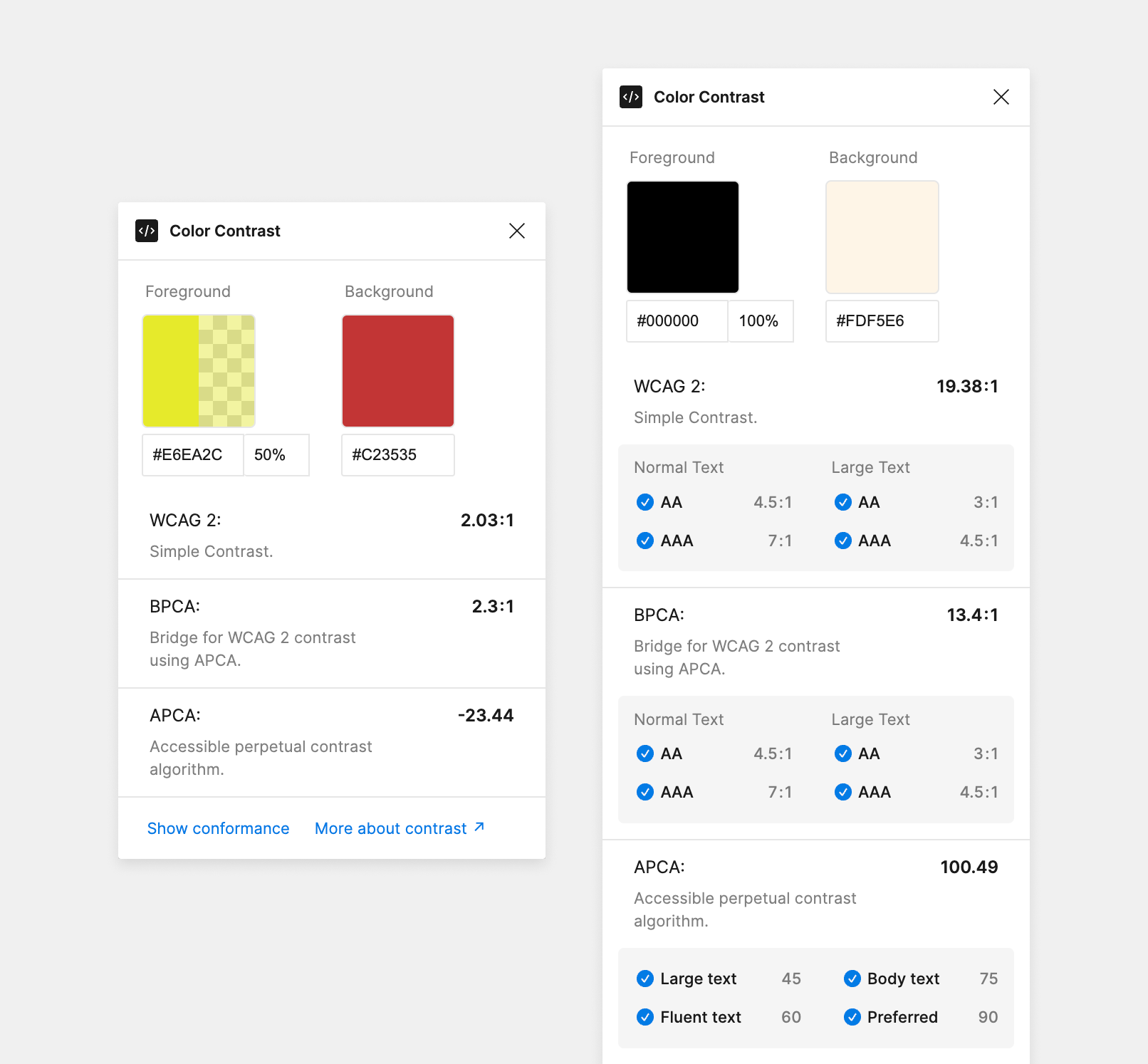
A bridge for WCAG 2 contrast using APCA technology.
Since WCAG 3 incorporating APCA is still in the draft phase, WCAG 2 simple contrast remain the standard for meeting accessibility compliance and government regulations. This led to the development of the Bridge PCA, a contrast algorithm that is fully backwards compatible with the WCAG 2, but uses APAC internally to determine the contrast. Bridge PCA is a drop-in replacement that can be used right now as a replacement for the WCAG 2 simple contrast.
Now, let’s input the color combinations from the previous example into the BPCA algorithm.

From the above image, it is clear that BPCA reports far better result in WCAG 2 ratios.
Figma Plugin
As a personal hobby project, I’ve developed a Figma plugin capable of reporting contrast values using three different algorithms: WCAG 2, APCA, and BPCA. Users have the option to manually enter foreground and background colors or select text or a frame directly on the Figma canvas to automatically extract the colors.
Why create a new plugin?
- It fails to differentiate between foreground and background colors.
- It lacks support for the BPAC algorithm, which is superior to the WCAG2.
- For APCA algorithm contrast evaluation, the alpha value of the text is not factored in, leading to inaccurate contrast values.