While working on a color system for my personal project, I came across an interesting article by Björn Ottosson introducing OKlab, a perceptually uniform color space based on CIELAB. Later I came across this another article by James O’Leary on HCT, yet another perceptually uniform color space, designed for Google’s Material color system. HCT is built on CAM16 (keeping the same hue and chroma) and CIELAB (for tone).
I’ve been experimenting extensively with both spaces. OKLab is already supported in CSS Color Module Level 4, making it easy to test in the browser. I also used Lea Verou’s Color.js library for further exploration. For HCT, I relied on Google’s open-source library, available in multiple languages, including C++ and TypeScript, to experiment and explore its capabilities.
In this article, I’ll share some of the insights on perceptual uniform color spaces and their advantages over standard color spaces like sRGB.
Nonlinearities in Human Color Perception
Human color perception is complex; we don’t perceive changes in color in a straightforward way based on physical measurements of light. Here are some of the nonlinearities:
We are more sensitive to certain wavelengths, such as green, than to others like red and blue. As a result, changes in hue within the green part of the spectrum are more noticeable than the same changes in the red or blue areas.
Our perception of brightness is closer to logarithmic rather than linear. For instance, if you look at a bright light, there is a certain number of photons reaching your eyes. If that number doubles, we might expect to perceive double the brightness, but that’s not the case; our perception of brightness increases more gradually.
Our perception of color is heavily influenced by surrounding colors and lighting conditions, a phenomenon known as chromatic adaptation. For instance, the same color can appear different depending on its background or lighting.
Color spaces like sRGB and P3 don’t account for these nonlinearities. The sRGB standard was designed to match the characteristics of CRT monitors from the 1970s. Although more perceptually accurate spaces like LAB existed at that time, they were computationally complex, so sRGB became the standard for most digital applications and remains widely used today.
Perceptually uniform color spaces like CIELAB, CIELUV, and OKlab aim to better match human color perception by arranging colors so that those appearing equally different to the human eye are spaced equally far apart. While these spaces aren’t perfect, they offer a significant improvement over non perceptual uniform color spaces.
Limitations of the HSL Color Space
Note:
Uneven Gradients:
Imagine you want to create a gradient from red to green across several rectangles. You might think that evenly adjusting the hue value between each rectangle will result in a smooth gradient.

From the above image, you can notice something unusual about this color shift. Although it transitions from red to green, certain colors seem to stand out more visually. This makes the transition look uneven.

In contrast, when interpolating the same colors using the HCT color space, the transition appears much smoother, with each color change looking gradual and consistent. This aligns better with how we perceive color shifts.
Inconsistent Lightness Across Hues:
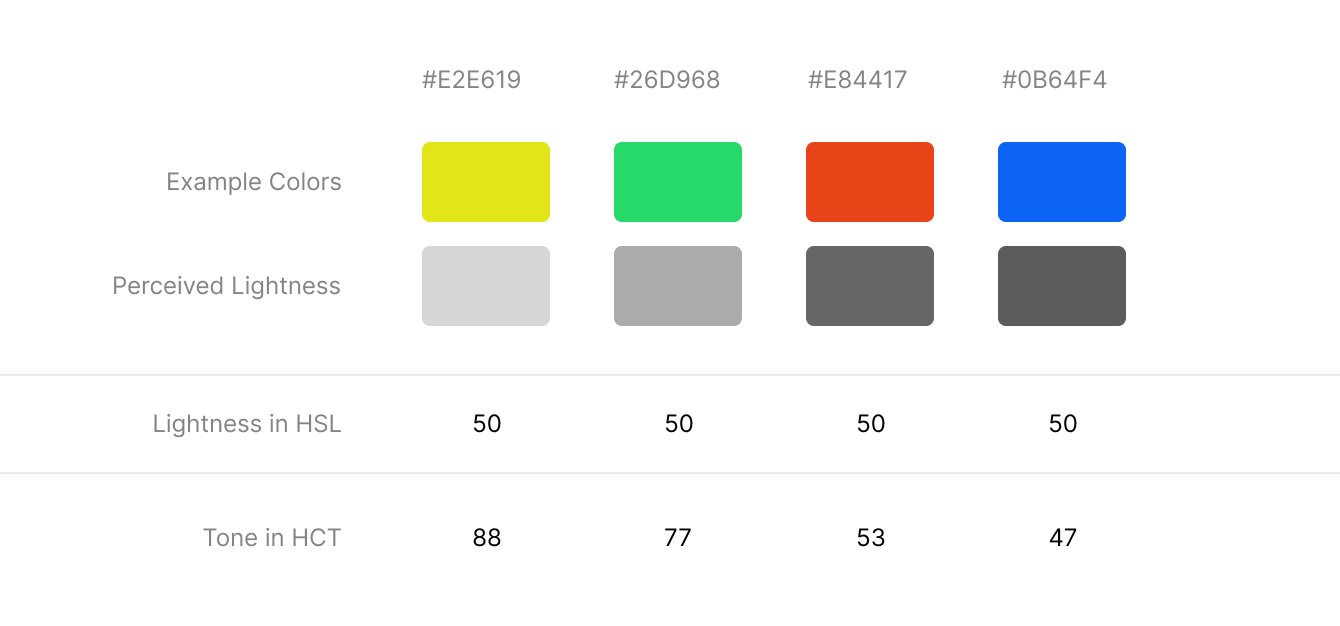
When designing a color system, maintaining uniform lightness across hues is important. However, HSL struggles with this.

In the image above, each color is set to the same lightness value (50) in HSL, but their perceived lightness varies. For instance, yellow looks brighter than green, green looks brighter than red, and red looks brighter than blue. This variation in brightness makes it nearly impossible to create a consistent color system with HSL. Notice that in the HCT color space, the tone value differs for each color and more closely matches the perceived lightness.
Now, let’s look at a color palette where each hue has been set to the same tone value.

In the image above, all hues have the same tone, resulting in a palette with uniform perceived lightness across all colors. This uniformity in perceived lightness makes it ideal for creating a cohesive color system.
As we’ve seen, whether you’re working on image processing or designing a color system for user interface, perceptually uniform color spaces offer clear advantages. By aligning color transitions and lightness with human perception, spaces like OKlab and HCT provide more natural and consistent results over standard color spaces like sRGB.