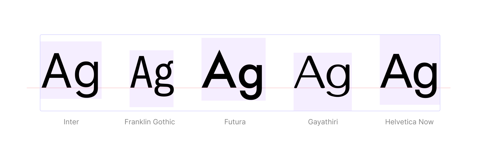
When building a design system, optimizing all components and UI elements for a single font is straightforward. However, the process becomes more complex when you need to support multiple fonts.
Recently, I built a design system that is capable of supporting three fonts (Zoho Puvi, Roboto, and Lato). In this post, I’ll share some key learnings from that process. Even if some of the solutions discussed here may not be immediately applicable to your design system, you can consider them as progressive enhancements.
Choosing the Right Fonts
If your design system supports multiple fonts, it’s essential to choose fonts with matching x-heights. The x-height refers to the height of lowercase letters (typically measured by the letter ‘x’) from the baseline. If the x-heights don’t align, the interface may feel visually inconsistent, and the UI may scale up or down depending on the fonts, as one font could appear larger than another even if they share the same font size.
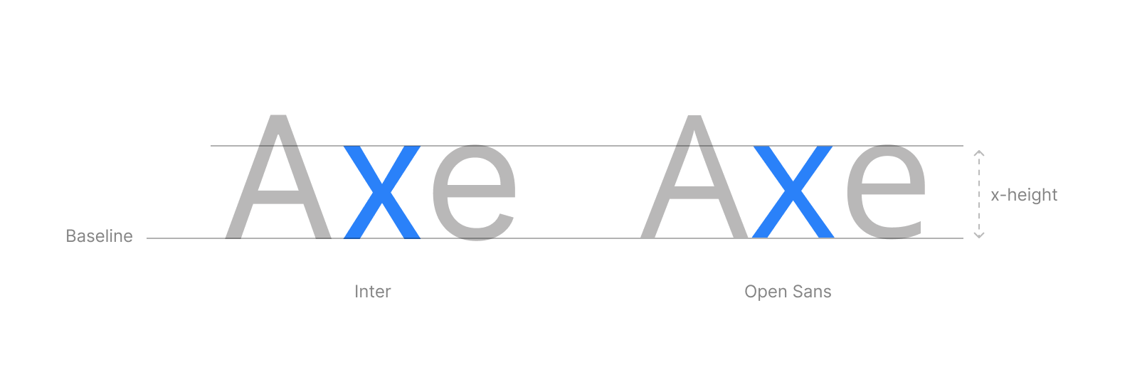
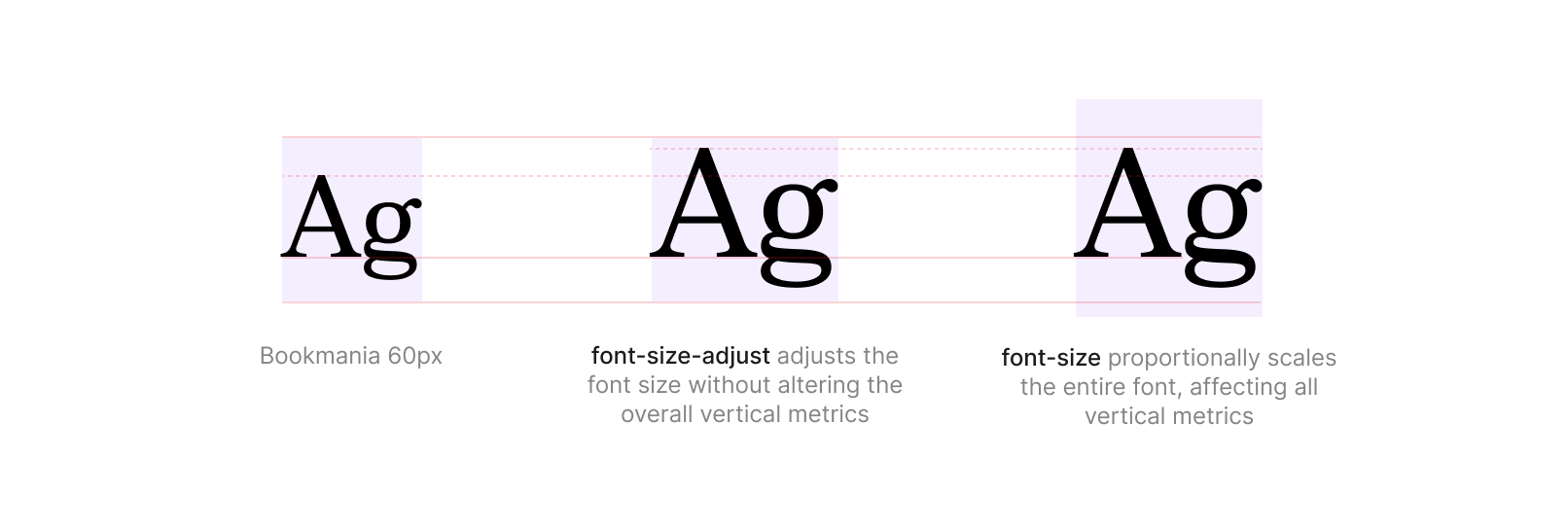
Sometimes, you may have no choice but to work with fonts that have already been selected, and those fonts might have very different x-heights. While adjusting the font-size property may seem like a solution, it also scales the font’s vertical metrics (like line-height), which can shift your entire layout. Instead, use the font-size-adjust property. This allows you to adjust the font size based on the other fonts without affecting their vertical metrics.
Note:
As of writing this article, font-size-adjust is supported in Chrome 127 and all major browsers as it is part of Baseline 2024. However, older browsers may still require a JS workaround.
Matching Vertical Metrics
A common issue when working with multiple fonts is alignment. You might align the top of the text perfectly with a block, but changing the font-family can completely disrupt that alignment.
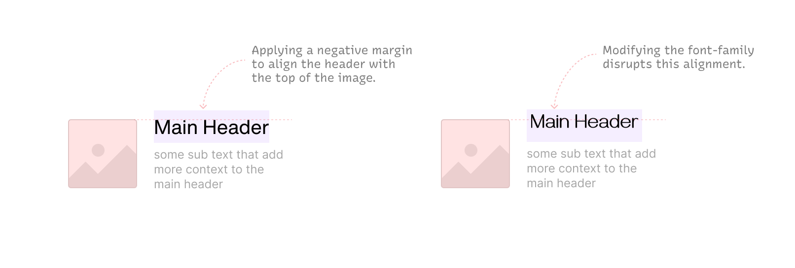
Similarly, you may vertically align text in a card or button, but when the font-family changes, the vertical metrics shift, causing the text to go out of alignment.
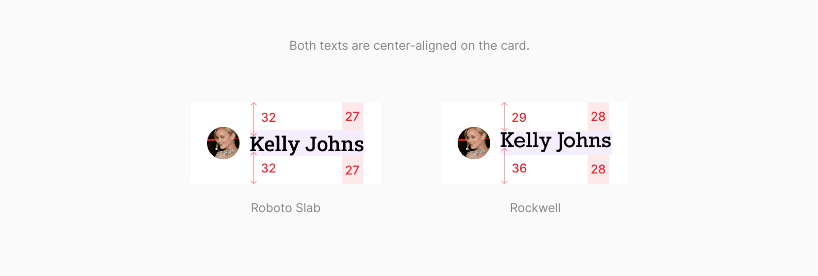
Additionally, if you’re supporting multiple languages, you might encounter several edge cases, as content length can be unpredictable.
The new text-box-trim and text-box-edge CSS properties were developed to address this issue. You can explore this GitHub repo to learn more. While these properties aren’t production-ready yet, you can test them in Chrome by enabling the relevant flags.
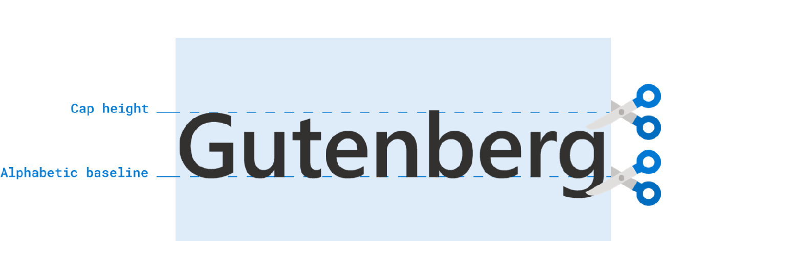
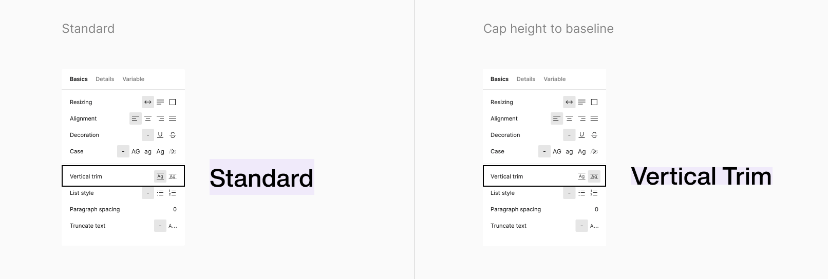
If you’re a designer, you can also experiment with this feature, as Figma recently introduced vertical trim, which implements the same concept.
In the design system I’m working on, it supports three fonts: “Puvi,” “Roboto,” and “Lato.” While Puvi and Roboto have nearly identical x-heights, Lato does not. Since text-box-trim and text-box-edge aren’t production-ready yet, I had to find another solution.
I needed to adjust Lato’s vertical metrics to match Puvi’s. Fortunately, Lato is open-sourced under the SIL Open Font License, which allows modification and reuse. I adjusted the vertical metrics of Lato manually using FontLab and compiled a new version of Lato that aligns with Puvi’s vertical metrics.
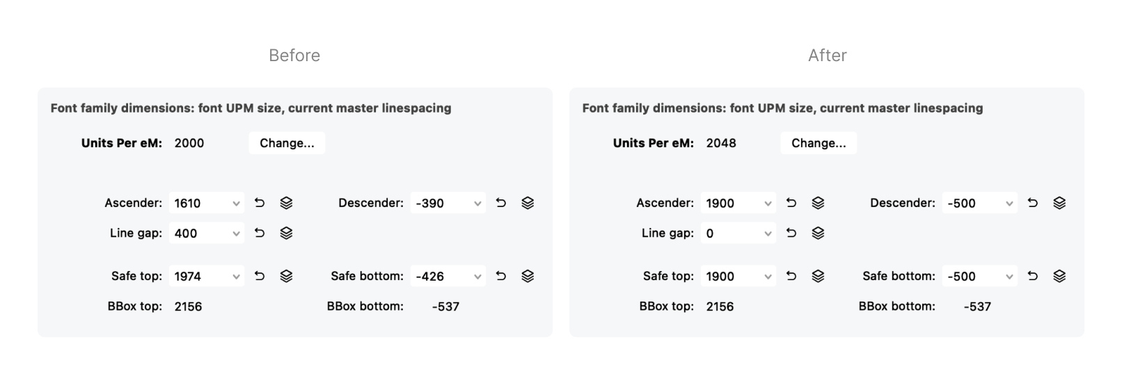
If you’re unfamiliar with OpenType font metrics, here’s a quick refresher.
Opentype font metrics:
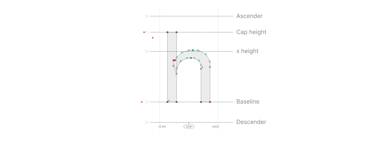
Units per em (UPEM): Represents the resolution of a font’s design grid. It defines how many units fit within the height of the font’s em square. All vertical metrics (e.g., ascender, descender) are expressed as fractions or multiples of the UPEM value.
Ascender: The height from the baseline to the top of the tallest letters, such as “h” or “k.”
Descender: The distance from the baseline to the lowest part of letters with descenders, such as “p” or “y.”
Safe Top/Safe Bottom: Ensure glyphs don’t get cut off at the top or bottom.
BBox Top/BBox Bottom: The highest/lowest point of any glyph in the font.
Line Gap: The additional vertical space between lines of text.
If you don’t have access to the font source or if the font isn’t open-sourced, you can still adjust vertical metrics in .otf and .ttf files, provided the font license allows it.
Caution:
Even with open-source fonts, always check the license, as some may restrict modifications or impose other limitations.
Matching Font Weights
Not all fonts are designed to work well together. Even if the regular weights match between fonts, the semibold weight of one font might appear bolder than the bold variant of another. Font weights are typically expressed in increments of 100 (e.g., 400 for regular, 500 for medium, and 600 for semibold), and it’s not possible to select intermediate values with static fonts.
Variable fonts solve this issue by supporting a continuous range of weight values, allowing you to pick any value within that range, offering greater flexibility and efficiency.
In my case, I needed to match the font weights of Roboto and Lato to Puvi’s weights. Here’s how the regular, semibold, and bold variants of these three fonts compares.
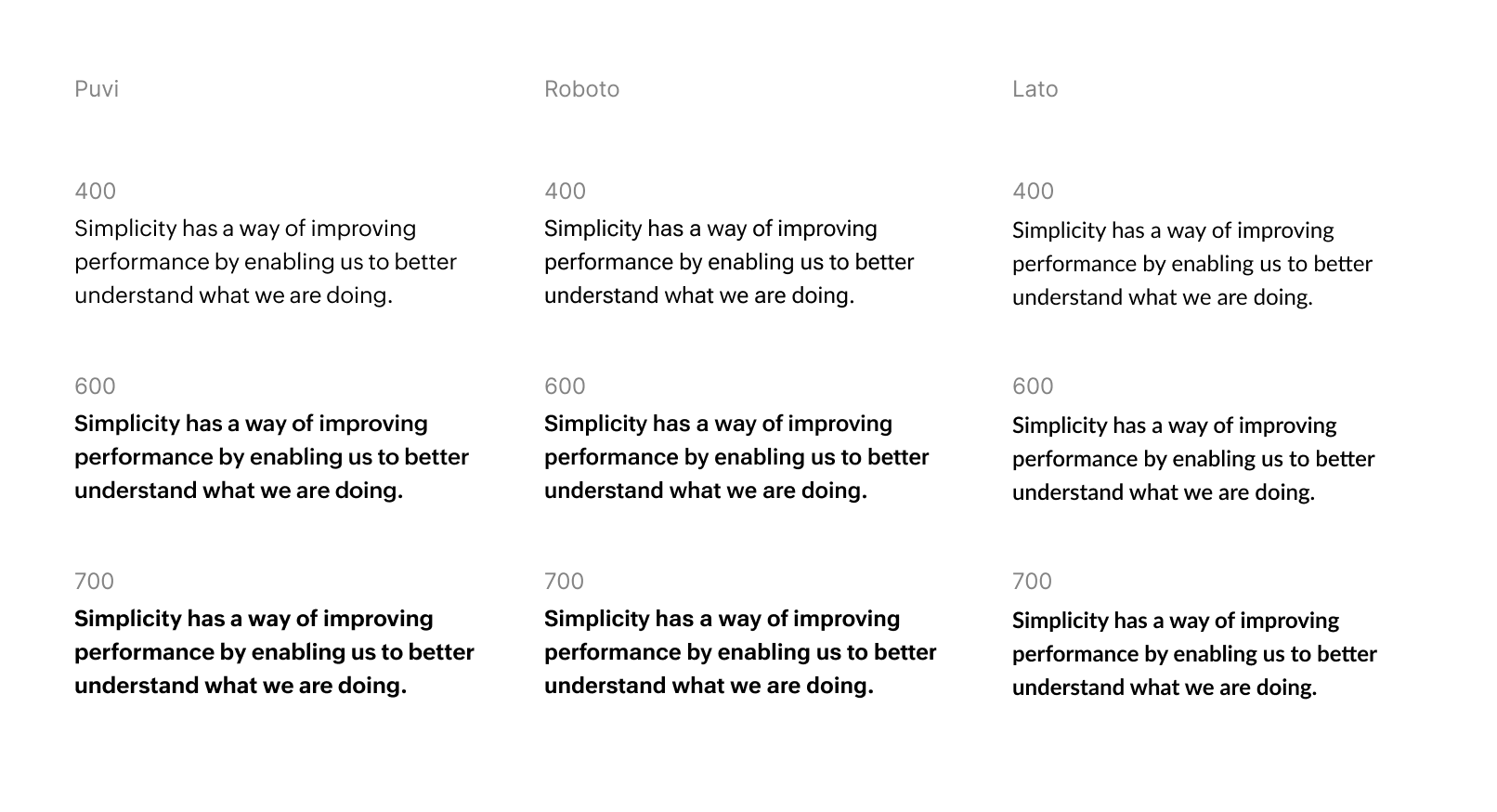
As you can see, the font weights differ significantly between them. To resolve this, I used the variable version of Roboto, Roboto Flex. However, Lato did not have a variable version. Since I had access to Lato’s source files, I used fontmake along with some Python scripting to create a variable font for Lato, allowing it to perfectly match Puvi.

In the image above, the font weights are mapped to ensure that the visual weight appears consistent across the different fonts.
Building your custom font
The variable font specification includes four default axes: wght (weight), wdth (width), slnt/ital (slant/italic), and opsz (optical size). If a font includes these axes, you can adjust them to achieve the desired result. Beyond these default axes, type designers can create custom axes, and this is where the magic happens.
Imagine this: you have a single font file that can render completely different styles across all possible weights and widths, just by tweaking the custom axes. Isn’t that amazing? Believe it or not, this is entirely possible with variable fonts—if you’re willing to invest the time to build them.
One of the best examples of this kind of typeface is Recursive, designed by Stephen Nixon. This font allows you to switch from a sans-serif to a monospace or a casual script typeface, as well as their italic variants and any combination in between. The characters across all subfamilies maintain consistent font metrics, enabling you to create a robust system without worrying about UI layout breaking when the font changes.
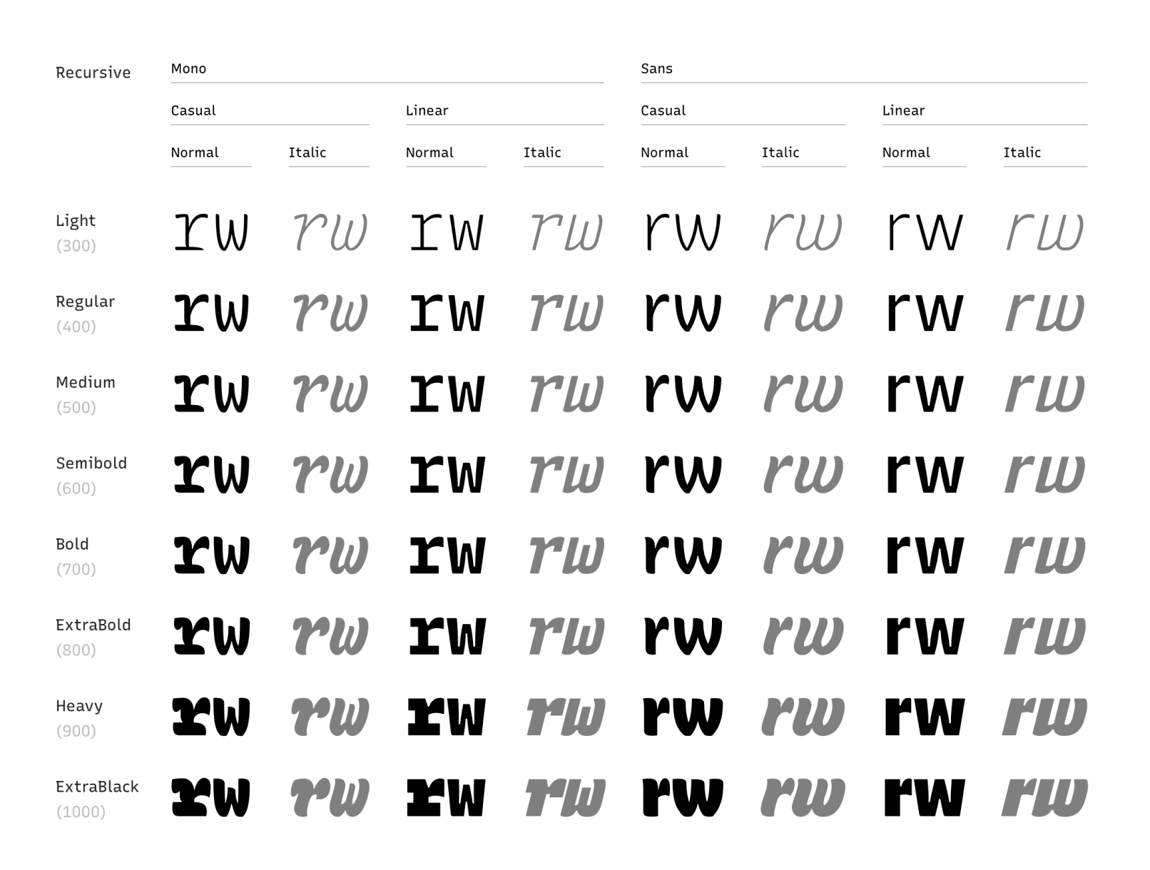
Recursive Variable Axes:
The Recursive font comes with 5 axes:
- wght: font weight, it can range from 300 to 1000.
- mono: monospace, it can range form 0 for sans-serif (porpotional font) to 1 for mono space (fixed width font)
- slnt: Determines the slant and it can range from 0 to -15 degree.
- crsv: cursive, it can take 0 to represent the roman and 1 to render cursive font.
You can style all these combinations in CSS using:
font-variation-settings: var(--mono), var(--casl), var(--wght), var(--slnt), var(--crsv);Building your icon font
One other challenge you might face is with the icons. When both the font and icons share the same vertical metrics, the icons naturally align with the text, making them easy to position inline with other content. And you can also easily customize their size, color, and style of the icon based on the font style. Icons can either be drawn directly within the same font source file or created as a separate icon font that shares the same vertical metrics.
One of the best example that comes to my mind is the SF Symbols. With the new San Francisco typeface, apple has added more than 3000 icons to the typeface. If you open the San Francisco typeface in some type design tool like fontlab, you can see the all of its glyphs along with the thousands of icons that are designed in proportion to the font.
This allows designer and developer to easily integrate icon seamlessly with the San Francisco typeface, matching its weights, sizes, and dynamic features and maintain the consistency in iconography across platforms (macOS, iOs, watchOs, and tvOS) and devices.